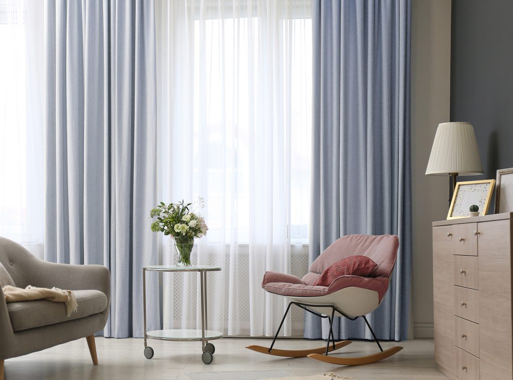
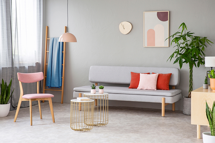
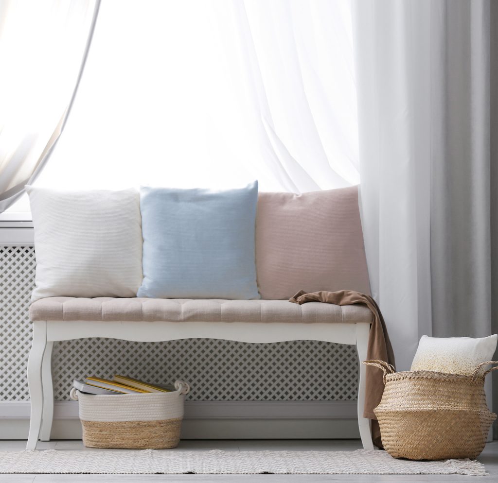
With the first flowers of Spring we enjoy subtle colours in soft, pastel tones, which are also trending in emotional interior decoration.
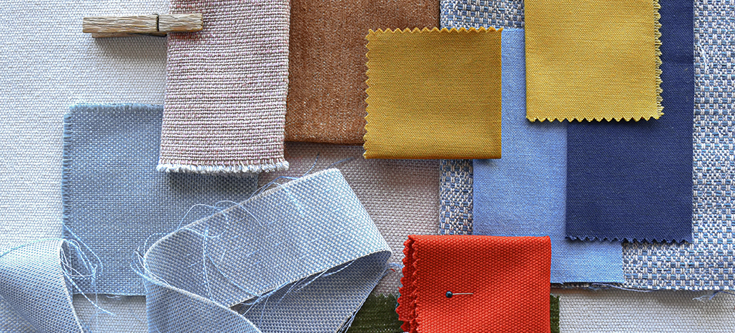
Dusty blues are combined with nude pink and contrasted in turn with mustards, earthy tones and khaki green. A colour palette that inspires balance, harmony and tranquility, peppered with the romantic air of vintage, recovered and reinterpreted.
This season we suggest you take a complete turn regarding the use of fabrics and textures and dare to mix and generate contrasts between jacquards, plains and upholstery fabrics.
Our Mimos, with a soft touch, can be combined with more robust textures such as Chatel or Megeve, as well as the velvety René with the natural shine of our Satin.
Nothing is impossible. Weave, colour and create your emotional world. Interiors become a surprising pastiche of patterns, textures and soft colours.
Using different textures directly affects your mood. Play with these new decorative trends focused on well-being. Catch up on chromotherapy. We advise you to opt for neutral tones as the main tone, combining it with powdery notes of colour in blues, greens or pinks with proven relaxing properties, which you can include in textiles such as plaids, cushions or curtains.


